|
|
Post by Admin on Feb 22, 2016 4:41:44 GMT
Author: Virgil Sovereign Plugin: VPop v1.0.0 Beta - Visit Proboards Plugin Library to Download Permissions: Editable Keys Used: None Description:| | Allows users to post pop-up content that appears when clicking or hovering. Pop-ups are also known as "tooltips", "rollovers", and "callouts".
The default configuration adds a button to the post editor (and if present, the augmented Quick Reply) that inserts [pop] tags in BBCode mode and anchor/pop-up pairs in Visual mode that convert to pop-ups when viewed outside the editor.
When speaking about pop-ups, an anchor is the text or content in a post that is hovered over or clicked to show a pop-up. The content shown and hidden is called the pop-up content, or simply "the pop-up". See Fig. 1.
The plugin supports a broad range of options in its configuration section, including:
- full HTML content in both pop-ups and anchors
- admin- and user-customizable pop-up titles, triggers, directions, sizes, and classes
- full BBCode and WYSIWYG editor compatibility; insert, delete, and modify pop-ups seamlessly in both editor modes
- numerous editor formats and options to suit admin preferences
- pop-up placeholders for when plugins cannot be run (mobile platforms, etc.), scripts are disabled, or VPop is disabled/uninstalled
- advanced style overrides allowing complete CSS customization of pop-up and anchor styles using the plugin UI
- ability to apply special admin-defined classes to pop-ups on a case-by-case basis
- over 50 tweaks, features, and options
|
| | Inserting Pop-ups
Pop-ups can be inserted into a post in one of three ways:
- clicking the "Insert Pop-up" button on the WYSIWYG editor
- highlighting content in the editor and clicking the "Insert Pop-up" button on the WYSIWYG editor
- typing a [pop] tag into the BBCode mode of the editor
Method 1. When method 1 is used, a dialog will open to request text and/or an image to use as an anchor (see Fig. 2). Users can choose to override the default position, title, trigger, and maximum width of the pop-up if they wish.
When the pop-up is inserted, it will appear as a [pop] tag in the BBCode mode of the editor (see Fig. 3), and as two dotted boxes in the Visual mode of the editor: one surrounding the anchor and one surrounding the pop-up content (see Fig. 4 and 5). Depending on plugin settings, the content of a pop-up may appear beside its anchor (see Fig. 4) or at the bottom of the editor (see Fig. 5). Also depending on the settings, the anchor and content may have special formatting, and the content may have a title. The content for a newly-inserted pop-up will be the content placeholder specified in the plugin settings (see Fig. 6). The anchor and content of a pop-up can be modified in either editor mode at any time.
If an image URL is specified and a number is entered into the "Anchor Text" field of the "Insert Pop-up" dialog, the new pop-up will be a thumbnail. A thumbnail is a common type of pop-up where the anchor is a smaller (thumbnail-sized) version of the pop-up (see Fig. 6, 9, and 14 for examples). The width of the smaller image (in pixels) will be the number in the "Anchor Text" field. This allows thumbnail pop-ups to be inserted quickly without any additional steps.
Method 2. Insertion method 2 is identical to method 1 except that instead of opening a dialog, the plugin "wraps" the pop-up around the currently-selected content in the editor, making it the anchor of the new pop-up. This method will not work if the selected content contains only whitespace (characters that are invisible, like spaces) since anchors must contain at least one non-whitespace character.
Method 3. Insertion method 3 involves manually typing a [pop] tag into the BBCode mode of the editor (or QuickReply). The plugin presently supports four [pop] tag formats:
- [pop=Anchor]Content[/pop]
Example: [pop=town]A town is a settlement with a population of 20,000 or more.[/pop]
This format is the simplest, but does not support attributes and can only be used if the anchor doesn't contain BBCode tags or the characters '[', ']', or '"'.
- [pop="Anchor" p1="v1" p2="v2"]Content[/pop]
Example:[pop="Superman" title="Picture of Superman" click][img src="http://photos.com/superman.jpg" style="max-width:100%;"][/pop]
Example: [pop="Fido"]"Fido" means "I am faithful" in Latin. It is a name commonly given to dogs.[/pop]
This format supports attributes, but can only be used if the anchor doesn't contain BBCode tags or the characters '[', ']', or '"'.
- [pop text="Anchor" p1="v1" p2="v2"]Content[/pop]
Example: [pop text="Twilight: New Moon" nt north]Twilight is a book series about sparkly vampires.[/pop]
This format is similar to format 2, but is a closer approximation to HTML. The text attribute containing the anchor text can be placed after other attributes if desired.
- [pop p1="v1" p2="v2"]Anchor||Content[/pop]
Example: [pop]hurricane||A hurricane is characterized by wind speeds greater than 74 miles (119 kilometers) per hour.[/pop]
Example:[pop title="My Horse"][img src="http://pethorse.gif" width="50"]||[img style="max-width:100%;" src="http://pethorse.gif"][/pop]
Example:[pop click width="550"][div style="text-align:center;"][b]Big[/b] dog!
[img src="bigdog.png" width="80"][/div]||I saw this dog while I was walking down the street.
[img src="bigdog.png"]
He's [i]huge![/i] :o [/pop]
This format has no limitations. Both the anchor and pop-up can contain any content and any characters. The content is separated from the anchor using two pipes ('||'). If more than one pair of pipes appears inside the tag, the plugin uses the first pair as the divider.
Pop-ups inserted with methods 1 and 2 use the preferred format specified in the plugin settings or else the closest allowable format if the anchor contains restricted characters or BBCode tags.
Pop-ups must not be nested, meaning the anchor or content of a pop-up may not contain other pop-ups inside. Nested pop-ups are automatically deleted by the plugin when a post is published or viewed in the Visual mode of the editor.
Also note that pop-ups must not have empty anchors or anchors containing only whitespace. Pop-ups with empty anchors or anchors containing only whitespace are automatically deleted by the plugin when a post is published or viewed in the Visual mode of the editor. The contents of a pop-up may be empty.
Removing Pop-ups
To remove a pop-up in the Visual editor mode, delete its anchor or delete all of the content in its anchor. When an anchor is deleted, its associated pop-up content is also deleted.
Editing and Moving Pop-ups
When editing either a pop-up's anchor or contents in the Visual editor mode, the borders of both its anchor and content boxes change colour to indicate which pop-up is being edited. This is useful in cases where pop-up content is placed at the bottom of the editor rather than beside its anchor.
Depending on the web browser being used, pop-up anchors can be moved in the Visual editor either by dragging them or by highlighting their contents and dragging them to a new location. The location of a pop-up's contents is automatically determined by the plugin; contents cannot be moved directly.
Switching Between Editor Modes
When switching between the BBCode and Visual editor modes, [pop] tags automatically convert to the preferred format in the plugin settings or else the closest allowable format if the anchor contains restricted characters or BBCode tags. Additionally, short form attributes will be converted to long form.
For example, if the preferred format is set to format 4, [pop] tags entered as
[pop nt c e text="gray"]Gray is [font color="#7F7F7F"]#7F7F7F[/font].[/pop]
[pop=red]Red is [font color="#FF0000"]#FF0000[/font].[/pop]
will convert to
[pop title="" trigger="click" position="e"]gray||Gray is [font color="#7F7F7F"]#7F7F7F[/font].[/pop]
[pop]red||Red is [font color="#FF0000"]#FF0000[/font].[/pop]
when switching between editor modes.
Viewing Pop-ups
A pop-up appears and disappears based on its trigger, which can be set to either click (clicking) or hover (hovering with the mouse). Regardless of the trigger, a pop-up can always be shown by clicking on its anchor and can always be hidden by clicking anywhere in the browser window (except on a link or interactive element inside the pop-up itself). Showing a pop-up will automatically hide all other pop-ups. If a pop-up's trigger is set to hover, it will stay open as long as the cursor remains over the anchor or, optionally, the pop-up itself.
Settings and Defaults
As of v1.0.0, the VPop UI (i.e. settings panel, see Fig. 7) has five tabs in addition to the usual "About" tab:
- Default Behaviour
Specify the default content placeholder, position, title, trigger, and maximum width settings for pop-ups.
- Styles
Specify how pop-ups, pop-up content, and pop-up anchors look.
- General
Specify general properties such as cursors, hovering times, fade times, editor button image, tooltip text, etc.
- Formats
Specify BBCode editor, Visual editor, and placeholder formats/options.
- Special Classes
Define special classes to customize pop-ups on a case-by-case basis.
The "out of the box" settings for VPop yield pop-ups in the style of Fig. 8, having the same background colour and text colour as the post containing the pop-up, a bold title, rounded corners, a thin black border, a shadow, and a medium stem. Pop-up anchors appear in the style of hyperlinks. |
(you can handle it): | | Pop-up Attributes
Each pop-up has five attributes that can be overridden in the "Insert Pop-up" dialog or by editing [pop] tags manually in the BBCode editor:
- Position Specifies the direction the pop-up will appear relative to the anchor: north (above), east (right), south (below), or west (left). If a pop-up will not fit inside the browser window at the specified position, it will "flip" to the opposite position. If it won't fit in the opposite position, the plugin will attempt positions in order: north, east, south, west. If it won't fit in any of these positions, it will be displayed centered on the screen.
Note that if a pop-up is displayed on the center of the screen and has a hover trigger, it will remain open while the cursor is over the pop-up, regardless of plugin settings. This is because such pop-ups necessarily cover their anchors.
- Title Specifies the text that will appear in the title bar above the pop-up content. By default, the title of a pop-up is the text in its anchor (this can be changed in the plugin settings). If a pop-up's title is empty, the title bar will not be shown.
- Trigger Specifies the action that causes the pop-up to show and hide: click (clicking) or hover (hovering with the mouse).
Regardless of the trigger, a pop-up can always be shown by clicking on its anchor and can always be hidden by clicking anywhere in the browser window (except on a link or interactive element inside the pop-up itself).
- Maximum Width Specifies the maximum allowable width (in pixels) of the pop-up content and pop-up title, not including the padding, border, or shadow surrounding it. A width of 0 is interpreted as "fit inside browser window".
Two default maximum widths are specified in the plugin settings: one for pop-ups containing text-only content, and one for pop-ups containing non-textual content (e.g. tables, lists, images, videos, etc.)
- Special Class Specifies a special admin-defined class to apply to the pop-up. Special classes provide different default attributes and styles to pop-ups on a case-by-case basis.
Legal pop-up attributes and their effects are:
| | position="DIR"
position=DIR | | sets pop-up position to DIR, which can be one of: n or north (north, above); e or east (east, right); s or south (south, below); w or west (west, left) | | | n
s
e
w
north
south
east
west | | shorthand for position="DIR" | | | title="TITLE" | | sets pop-up title to TITLE; the special token $! is replaced with the text in the pop-up anchor | | | nt | | shorthand for title="" (i.e. "no title") | | | trigger="TRIG"
trigger=TRIG | | sets pop-up trigger to TRIG, which can be one of: c or click (clicking); h or hover (hovering with mouse) | | | c
h
click
hover | | shorthand for trigger="TRIG" | | | width="WID"
width=WID | | sets maxmimum pop-up width to WID pixels; a width of 0 is interpreted as "fit inside browser window" | | | class="CLASS"
class=CLASS | | sets the special class of the pop-up to CLASS |
Examples:
| | [pop n c width=225]...[/pop]
Pop-up appears north of its anchor, is triggered by a click, and has a maximum width of 225 pixels.
[pop nt class=horsefact trigger="hover"]...[/pop]
Pop-up has no title, uses special class "horsefact", and is triggered by mouse hover.
[pop="Final Fantasy" title="Did You Know?: $!" east]...[/pop]
Pop-up has the anchor text "Final Fantasy", a title "Did You Know?: Final Fantasy", and appears east of its anchor. |
Any pop-up with an invalid position will use the default pop-up position. Any pop-up with an invalid trigger will use the default pop-up trigger. Any pop-up with an invalid maximum width will use the default maximum width for the type of content in the pop-up. Unrecognized attributes will be ignored and deleted when a post is published or the editor is switched to Visual mode.
If an attribute is set more than once in a tag, all but the last value is ignored.
Pop-up Placeholders
Proboards plugins can't be run in some circumstances. For example, plugins won't run on platforms such as Tapatalk and Facebook, or when a user has scripts disabled in their browser. Additionally, an admin may choose to disable or remove VPop. To help forum administrators deal with these issues gracefully, VPop publishes posts in placeholder mode where pop-up contents appear as placeholders rather than live pop-ups.
Placeholders are configurable in the plugin settings under the Formats tab. By default, pop-ups containing only text are expanded inside angular brackets (〈〉) next to their anchors, and pop-ups containing non-textual content are placed at the bottom of a post (see Fig. 9 and 10). The plugin can be configured to show either type of content inline or at the bottom of the post, or to hide it entirely. For content placed at the bottom of a post, admins can choose whether to include titles, numbers, and/or a dividing line between the post and the pop-ups. Because pop-ups are inactive in placeholder mode, their anchors will have no special formatting or cursor applied to them by default. This setting can be changed in the plugin configuration.
Any page can be viewed in placeholder mode by either: i) disabling VPop, or ii) appending either &no-vpop or #no-vpop to the URL in the address bar and visiting/reloading the page. As a general rule, pop-ups containing non-textual content are usually disruptive enough to the content layout that they should be placed at the end of a post or hidden.
Note that settings for placeholder mode are independent of settings for viewing pop-ups in the Visual mode of the editor. |
(for the perfectionists): | | Special Classes
Special classes are admin-defined classes that can be applied to pop-ups on a case-by-case basis. Each special class comes with its own default settings for pop-up attributes and content placeholder, and attaches a class to pop-ups and anchors that can be uniquely targeted by CSS selectors.
Special classes are mainly useful for letting users create different 'types' of pop-ups. For example, an admin might want a "Gardening Facts" pop-up with a flowery border and "insert gardening fact here" content placeholder; an "Image Rollover" pop-up with no border, a transparent background, and wider-than-usual default maximum width; and a "Basic Tooltip" pop-up with a smaller font, no title, and minimalist look. Special classes allow these kinds of case-by-case customizations.
Special classes are defined in the plugin settings under the Special Classes tab (see Fig. 11). Each class has the following parameters:
- A case-sensitive alphanumeric class name (required). The class name must be a valid CSS class name without hyphens or underscores, e.g. imroll or flowey1. Because class names appear as the value of the class attribute in BBCode, shorter class names are generally better.
- A human-readable class name (optional) that describes the class, e.g. "Image Rollover", "Gardening Facts". The human-readable class name appears in the "Special Class" drop-down list in the "Insert Pop-up" dialog. If the human-readable name is omitted, the special class will not appear in the "Special Class" drop-down list and the only way to apply the special class is to manually type in a class tag in the BBCode editor.
- A content placeholder override (optional) to replace the default content placeholder if desired.
- Default setting overrides for all pop-up attributes (optional) to specify new defaults for the class if desired.
- An "Apply Class in Editor" flag specifying whether pop-ups should be marked with the class in the Visual mode of the editor. Any special CSS properties applied to live pop-ups by the class will be previewable in the editor. Admins should beware that changes to some CSS properties may complicate editing pop-up content.
All special classes with human-readable names will appear in the "Special Classes" drop-down list in the "Insert Pop-up Dialog", which is the simplest way for users to apply special classes to pop-ups. If no special classes with human-readable name are defined, the "Special Classes" drop-down will not appear in the dialog.
VPop Element Structure
The element structure of a live pop-up is shown in Fig. 12.
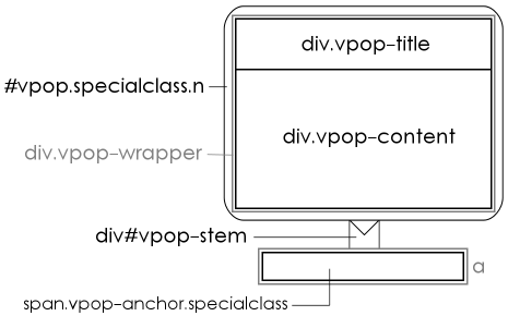 | | Fig. 12 VPop element structure, for reference purposes. |
Descriptions of the elements are as follows:
- div#vpop
This element is the parent container of the pop-up proper. It should be selected as #vpop to apply styles to all pop-ups, or as #vpop.specialclass to target only pop-ups having special class specialclass. Its background colour determines the border colour of the pop-up; its border colour determines the colour of the stem; its margins determine the width of the pop-up border; its corner radius determines the corner radius of the pop-up box.
The plugin also assigns one of five classes to this element depending on where the pop-up appears relative to its anchor: n (north), e (east), s (south), w (west), c (center). These classes are useful for selectively applying styles (e.g. directional shadows, decorations appearing outside the pop-up borders, etc.) to pop-ups in specific positions.
- div.vpop-wrapper
This element is a transparent div wrapping the pop-up title and content. It has no borders, padding, or margins by default. It should be selected as .vpop-wrapper (all pop-ups) or .specialclass .vpop-wrapper (pop-ups with class specialclass). It's main function is to set a common maximum width for the title and content divs. It is also the most element useful for setting a fixed width, minimum width, etc. if desired.
- div#vpop-stem
This element provides the stem for the pop-up. It should be selected as #vpop-stem (all pop-ups) or .specialclass #vpop-stem (pop-ups with class specialclass). Its dimensions may be overridden, but VPop will not account for any changes made to stem size outside of the plugin settings when positioning the pop-up. The stem inherits its colour from the #vpop border colour, hence the best way to change its colour is to modify the border-color CSS property of the #vpop element. The visibility property of the stem can be set to hidden to selectively hide the stem, although this will not modify the position of the pop-up.
- div.vpop-title
This element contains the pop-up title if a title is present. It should be selected as .vpop-title (all pop-ups) or .specialclass .vpop-title (pop-ups with class specialclass). If a pop-up has no title, this element will not exist (as opposed to having a display property of none). Its background colour determines the title background colour. Its properties determine the properties of any content in the title bar. To avoid potential mismatches in title and content size, its width properties shouldn't be modified directly. (Use .vpop-wrapper instead.)
- div.vpop-content
This element contains the pop-up content. It should be selected as .vpop-content (all pop-ups) or .specialclass .vpop-content (pop-ups with class specialclass). Its background colour determines the content background colour. Its properties determine the properties of any content in the pop-up. To avoid potential mismatches in title and content size, its width properties shouldn't be modified directly. (Use .vpop-wrapper instead.)
- span.vpop-anchor
This element contains a pop-up anchor. It should be selected as .vpop-anchor (all pop-ups) or .vpop-anchor.specialclass (pop-ups with class specialclass). There is presently no way of selecting specific anchors except through special classes. (I may add marker classes for "active" and "visited" anchors in future releases if there's any demand for the feature.) If "Anchor Style" is set to "Appear as Hyperlink" in the plugin settings, anchor spans will be wrapped in a tags.
The element structure of pop-ups in the Visual mode of the editor is similar, but differs from the structure of live pop-ups in three ways:
- The div#vpop (parent container) element and div#vpop-stem (stem) elements are omitted in the editor. If a pop-up has a special class and the "Apply Class in Editor" flag for that class is set, the class is applied to the .vpop-wrapper (wrapper) element. The recommended selectors for all elements therefore remain valid in the editor except for the #vpop and #vpop-stem selectors (which are ignored by the editor) and the .specialclass .vpop-wrapper selector, which should become .specialclass.vpop-wrapper (note the lack of a space).
The wrapper element of a specially-classes pop-up can be selected in both the editor and live posts using the selector .specialclass .vpop-wrapper, .specialclass.vpop-wrapper
- The .vpop-wrapper (wrapper) element will be a span rather than a div if (and only if) "Preferred Visual Content Placement" is set to "Content Appears Beside Anchor" under the Format tab in the plugin settings.
- VPop automatically marks the body element of live pages with the v-live class, and the body element of the Visual editor with the v-editor class. Hence, to select pop-up elements in live pop-ups only, prefix selectors with .v-live and a space (e.g. .v-live .vpop-content to select the pop-up content only in live pop-ups). Similarly, to select pop-up elements in the editor only, prefix selectors with .v-editor and a space.
As a general rule, do not modify the position, top, left, display, opacity, or float CSS properties of any VPop element unless you're certain you know what you're doing.
If the border radius of a pop-up is modified in any way besides modifying "Border Style" in the plugin settings, care should be taken to ensure that the element selected by
.vpop-wrapper > :first-child
has properties border-top-right-radius and border-top-left-radius set to the border-radius of #vpop minus any space between the outer border and .vpop-wrapper's children. Similarly, the element selected by
.vpop-wrapper > :last-child
should have its border-bottom-right-radius and border-bottom-left-radius set this way. If your eyes just glazed over, stick with the plugin settings if you want to modify border radius.
Advanced Style Overrides
VPop generates styles for pop-ups and anchors dynamically in a four-step process:
- A base style sheet is imported from the plugin global header component. The base style sheet for live pop-ups is separate from the base style sheet for pop-ups in the editor. The former is the style element defined under "VPop Live Styles"; the latter is the style element defined under "VPop Editor Styles". Either base style sheet may be modified, but using the "Advanced Style Overrides" feature to modify pop-up styles is typically easier and will allow changes to persist across VPop updates.
- Rules are added, removed, or modified in the style sheet based on plugin settings.
- Rules defined in the Advanced Style Overrides section of the plugin configuration under the Styles tab are applied to the style sheet.
- Certain CSS properties (in particular, top, left, display, and opacity) are applied inline.
From a customization standpoint, the most important step is the application of Advanced Style Overrides (ASOs). Each ASO is a pair of data: a CSS Selector, and a set of CSS Properties (see Fig. 13). Adding an ASO to the set of Override Rules under "Advanced Style Overrides" in the Styles tab of the plugin settings is roughly equivalent to appending
<CSS Selector> {
    <CSS Properties>
}
to the end of both the live and editor style sheets after all basic styles have been merged in, with two important exceptions:
- If the CSS Selector of an ASO is equivalent to a selector already defined in the style sheet, the CSS Properties will be added to (possibly overwriting) properties in the existing selector rather than being appended to the end of the style sheet. This has subtle implications in terms of rule precedence.
- In addition to regular CSS properties of the form css-property: value;, CSS Properties may also contain properties of the form css-property:;, i.e. with no value. These valueless properties are interpreted to mean "remove property css-property from any existing selector equivalent to CSS Selector".
For example, the ASO with selector .vpop-selected and properties
border-color:;
background-color: lightblue !important;
will delete the existing rule in the editor style sheet that causes pop-up borders to turn blue when being edited and replace it with a rule that turns their backgrounds blue.
In every other respect, ASOs are identical to regular CSS rules and may make use of any valid CSS3 selectors and properties.
Some example sets of ASOs:
| | For pop-ups with a style similar to the Proboards tooltips (see Fig. 14), having settings:
- Default Title: (blank)
- Border Style: Thin, with Shadow
- Corner Style: Slightly Rounded Corners
- Stem Size: Small Stem
- Border Colour: #232323
- Background Colour: #232323
- Text Colour: #ffffff
| CSS Selector | CSS Properties | .vpop-content
| text-shadow: 0px 0px 2px black;
font-size: 11px; |
For pop-ups using harry, a "Harry Potter Facts" special class (see Fig. 15), having special class settings:
- Content Placeholder Override: insert Harry Potter fact here
- Title Override: Did You Know?: $!
- Maximum Width Override: 500
- Apply Class in Editor: (checked)
| CSS Selector | CSS Properties | | .harry .vpop-title | background: black url('./harry-potter-logo.gif') right no-repeat;
background-size: contain;
font-family: 'Times New Roman';
font-size: 22px;
font-variant: small-caps;
min-height: 26px;
color: #eecc44;
padding-right: 50px;
| .harry .vpop-content
| background-color: black;
color: white;
| | .vpop-anchor.harry | padding: 1px 1px 1px 1px;
background-color: #ddf; |
For pop-ups using imroll, an "Image Rollover" special class with transparent background (see Fig. 9), having special class settings:
- Content Placeholder Override: insert image here
- Title Override: none
- Maximum Width Override: 0
- Apply Class in Editor: (checked)
| CSS Selector | CSS Properties | #vpop.imroll, .imroll .vpop-wrapper > *
| background-color: transparent;
border-style: none;
box-shadow:; |
For pop-ups using warcats, a "Warrior Cats" special class (see Fig. 16), having special class settings:
- Content Placeholder Override: insert Warrior Cats fact here
- Title Override: $!
- Maximum Width Override: 520
- Apply Class in Editor: (not checked)
and with the following font import appended to the VPop Live Stylesheet in the global header (note that this will not work on your forum unless you're hosting fonts on a server that permits you to use them cross-domain):
@font-face {
    font-family: 'Adine Kirnberg';
    src: url('./fonts/adine-kirnberg-webfont.eot');
    src: url('./fonts/adine-kirnberg-webfont.eot?#iefix') format('embedded-opentype'),
    url('./fonts/adine-kirnberg-webfont.woff2') format('woff2'),
    url('./fonts/adine-kirnberg-webfont.woff') format('woff'),
    url('./fonts/adine-kirnberg-webfont.ttf') format('truetype'),
    url('./fonts/adine-kirnberg-webfont.svg#adine_kirnbergregular') format('svg');
    font-weight: normal;
    font-style: normal;
}
| CSS Selector | CSS Properties | | #vpop.warcats | background: url('./warcat.png')
transparent bottom right no-repeat;
padding: 3px 147px 132px 6px;
box-shadow: none;
| | .warcats .vpop-title | height: 36px;
font: 48px "Adine Kirnberg", serif;
color: #315;
text-shadow: 1px 1px 2px rgba(0,0,0,0.55);
background-color: transparent;
position: relative;
left: -35px;
| | .warcats .vpop-title::first-letter | font-size: 72px;
vertical-align: text-top;
padding-right: 5px;
| | .warcats .vpop-content | font: italic 15px "Times New Roman", serif;
min-width: 150px;
min-height: 75px;
color: #444;
background-color: transparent;
padding: 8px 8px 16px 16px;
| .warcats .vpop-content::first-letter
| padding-left: 45px;
| | .warcats .vpop-wrapper | background-color: rgba(255,255,255,0.93);
border-radius: 36px;
position: relative;
left: 25px;
border: 1px solid rgba(60,30,180,0.5);
| | .warcats .vpop-content::first-letter | padding-left: 45px;
| | .warcats #vpop-stem | visibility: hidden; |
|
Known Issues and Limitations
- Anchors containing both text and non-textual content may appear with an incorrect layout in placeholder mode in some circumstances. This is a result of Proboards not supporting the display: inline-block; CSS property on elements in user content. If this becomes a serious issue for you, get on Proboards about it.

- As of v1.0.0, setting either "Content Placeholder Format (Text-Only)" or "Content Placeholder Format (Non-Textual)" to "Content Appears at Bottom" and the other setting to "Content is Hidden" will cause both types of content to appear at the bottom of a post in placeholder mode. This is a known defect that would require an inordinate amount of effort to fix, and I've elected to leave it be given its low impact and the rarity of these combinations. All remaining 7 combinations (of 9 total) are supported.
- Due to the way the Proboards Visual editor handles block elements like divs, applying alignment styles (e.g. align left, align center, etc.) to content inside pop-ups and anchors is unlikely to produce the desired effect in Visual mode. Depending on the web browser being used, applying these styles to content selected in a pop-up may cause the pop-up contents to fragment, move outside the pop-up, or disappear. The alignment may also target content other than what is selected. Unfortunately, this defect is an unavoidable byproduct of the WYSIWYG editor not being designed to "handle" pop-ups. The natural workaround is to apply alignment styles in the BBCode editor.
- At least 20% of the time spent developing this plugin was dedicated to solving the issue of cursoring in an elegant way for all major browsers. Cursoring is the art of ensuring that the caret (the blinking line) can go everywhere it's supposed to go, such as in front of pop-ups, inside pop-ups, and after the end of pop-ups, and can't go (or at least can't do any damage) where it's not supposed to go, such as inside titles, in between an anchor and its content (when in side-by-side mode), or outside a pop-up in the "Pop-ups" section of a post (when in content-at-bottom mode). The Proboards WYSIWYG editor doesn't handle cursoring particularly well for the same reason that all online WYSIWYG editors don't handle cursoring well: they rely on browsers' contenteditable HTML editing facilities, which are notoriously fickle, primitive, and vary significantly from browser to browser.
Thanks to an extensive set of hacks, fudges, invisible elements, on-the-fly reformatting, and other digital evils, cursoring in and around pop-ups in Visual mode should generally behave seamlessly for both the cursor and mouse. In particular, users should find it easy to position the caret before the start of a pop-up, at the front of a pop-up, inside a pop-up, at the end of a pop-up, and after the end of a pop-up, whether using the mouse, keyboard, or both.
There are still some notable quirks, however: i) in IE, cursoring with the keyboard will "skip over" pop-up contents in some circumstances, ii) in Firefox, the caret will appear at an odd location (roughly 10 pixels below the usual baseline) when positioned immediately after a pop-up, and iii) in Chrome, hitting 'Enter' to insert a new line after a pop-up will occasionally do nothing the first time 'Enter' is pressed if the pop-up appears immediately before the "Pop-ups" section in content-at-bottom mode. While I would appreciate reports of any other odd behaviours related to cursoring, please note that the probability of my adding additional hacks to fix them is negligible. - Another 10% of the time spent developing this plugin was devoted to dealing with IE "paragraphing clusterfun". For reasons unknown to anyone besides Steve Ballmer and his dog "Bingo", the lead developer of the IE team, Internet Explorer determinedly wraps everything that's entered into a contenteditable element--text, images, and even line breaks--in p tags, which causes no end of problems with pop-ups due to the way the Proboards Visual editor handles block elements. If you've ever quoted a post and discovered the BBCode looked like:
[p]I am a warrior cat.[/p][p]
[/p][p][i][b][/b][/i]
[/p][p]I fight warrior dogs.[/p][p]
[/p]
with a million tags that serve no discernible purpose, you know you've got an IE user on your hands. (It's sad, I know.  ) )
Thanks to another set of hacks, fudges, and digital evils, VPop strips out p tags and replaces them with br tags on a best-effort basis. In most cases, the only observable effect on the user's experience will be that their BBCode is no longer littered with useless tags. Even so, some edge cases still exist where a published post will have an extra newline that doesn't appear in the Visual editor when working in IE. These "phantom newlines" can be detected by switching the editor to BBCode mode and back again. Fortunately, the circumstances where they appear are tolerably rare, hence they should only be a minor annoyance for IE users. (They're used to those; trust me.) - The plugin has not been tested on Safari, Edge (a.k.a. IE 12), or Opera.
- Although the plugin is editable and open source, it was written in JavaScript ES6 and transpiled into ES5 using the "Babel" transpiler. Generally speaking, the transpiler turns the original code 30% of the way into spaghetti. As there is no way to package the original source code with the plugin, you can PM me or request a copy of the original code if you're interested in playing around with it.
Compatibility with Other Plugins
VPop converts pop-up placeholders to live pop-ups through excision, meaning that pop-up contents are excised (removed) from the DOM when a page is first loaded and stored in a DocumentFragment until needed. If another plugin that converts placeholders into live content is being run at the same time as VPop, the plugins may interfere with each other in two ways:
- If the content of a pop-up contains placeholder elements that must be activated by the other plugin, these elements will not be activated if VPop goes live before the other plugin.
Ordinarily, VPop goes live when its global footer is processed, which occurs before the ondomready and onload events are fired. Since most plugins go live in response to one of these two events, this presents a serious problem for embedding their content in pop-ups. (A notable exception is the other V- plugins, which also go live in the global footer and hence will work inside pop-ups so long as they come before VPop in the plugin list.)
The surest way to remedy the conflict is to prevent VPop from going live until after other plugins have gone live. See Running Conditionally below for details on how to accomplish this.
- If the other plugin goes live by reformatting a post's HTML rather than by operating on the DOM (which is common, since it's easier to code), trigger events attached to pop-ups will be deleted when the other pop-up goes live. As a result, pop-up anchors won't trigger. They'll sit there doing nothing at all, similar to the Internet Explorer debugger when one attempts to set a breakpoint.
Fortunately the remedy for this problem is the same as for Problem 1: delay the launch of VPop until after the conflicting plugin(s) have gone live. See Running Conditionally below for details on how to accomplish this.
Running Conditionally
By default, VPop makes pop-ups accessible for editing and viewing by all users on all pages. VPop can be disabled on a theme- or group- conditional basis by editing its permissions in the Forum Plugins control panel. Disabling the plugin for specific themes/groups will prevent affected users from inserting pop-ups (even using BBCode tags) and cause them to see pop-ups in placeholder mode (as described in Pop-up Placeholders).
For greater control over the conditions under which VPop is run, admins may take the following steps:
- Under Run Conditionally in the General tab of the VPop settings, set the "Automatically Run..." setting to the value that reflects which components of VPop should be run automatically under all conditions. The default, "Everything", grants unconditional access to both viewing and editing pop-ups. "Viewing Pop-ups Only" grants unconditional access to viewing pop-ups (when live) but not to inserting, modifying, or viewing them in the editor. "Nothing" prevents the plugin from doing anything unconditionally.
- Conditionally invoke the command
$V.Pop.init( [mode] );
where [mode] is one of: 'all' (allow both viewing and editor access), 'live' (allow only viewing access), 'none' (do nothing).
For step 2, admins may make use of the Condition X plugin if desired. In this case, the steps become:
- Same as step 1 above.
- Install the "Condition X" (Cond X) plugin.
- Optionally, change the descriptive name of Cond X to something like "VPop Launcher" to make its purpose clear.
- Set conditions in the Who, When, Where, Why, and Advanced tabs of Cond X settings.
- Set "Footer" under the What tab to the code:
<!-- Start VPop Footer -->
<script type="text/javascript">
    $V.Pop.init( [mode] );
</script>
<!-- End VPop Footer -->
where [mode] is the desired level of access.
In this way, conditions on viewing and/or editing pop-ups can be precisely controlled.
To delay launch of VPop pop-ups going live, it suffices to set "Automatically Run..." to "Nothing" and, rather than invoking the command
$V.Pop.init( [mode] );
instead invoke:
$( $V.Pop.init.bind( void 0, [mode] ) );to delay launch until the ondomready event
$('body').on( 'load', $V.Pop.init.bind( void 0, [mode] ) );to delay launch until the onload event
$( setTimeout.bind( void 0, $V.Pop.init.bind( void 0, [mode] ), 0 ) );to delay launch until after all code responding to the ondomready event has executed
Note that in virtually all cases, configuring Cond X to execute command 1 will resolve the two conflicts described under Compatibility with Other Plugins. |
(a.k.a. Screenshots): 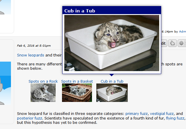 Fig. 1 Fig. 1 - A post containing numerous pop-up anchors and an open pop-up. The pop-up content "pops up" above the normal content of the webpage when triggered, hence the name "pop-up".
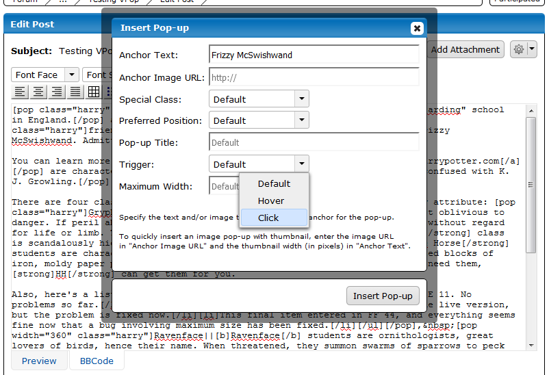 Fig. 2 Fig. 2 - The "Insert Pop-up" dialog. The dialog can create text-only, text-and-image, image-only, and thumbnail anchors, and override the default pop-up attributes.
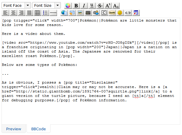 Fig. 3 Fig. 3 - The BBCode editor when augmented with VPop. An additional "Insert Pop-up" button (with configurable graphic and title) appears on the editor control panel. Pop-ups are represented by [pop] tags in a variety of formats.
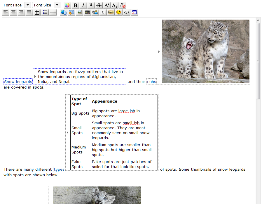 Fig. 4 Fig. 4 - The Visual editor when augmented with VPop, in content-beside-anchor mode, with titles not shown. Pop-up anchors and content are surrounded by dotted boxes to indicate their status as pop-ups. The borders around the anchor and content of the pop-up being edited are blue to indicate which pair is being edited.
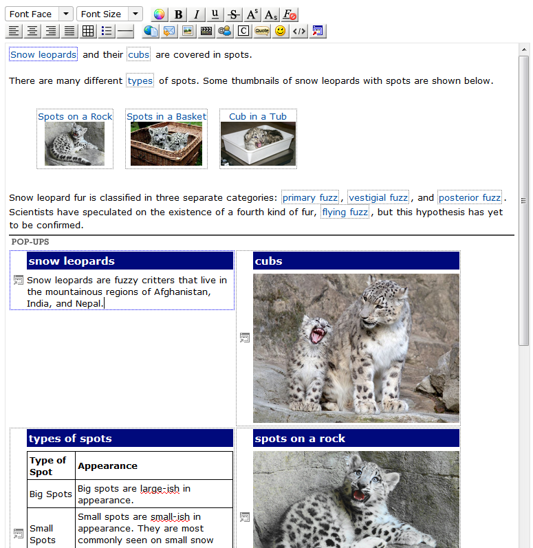 Fig. 5 Fig. 5 - The Visual editor when augmented with VPop, in content-at-bottom mode, with titles shown and visual styles applied in editor. Rather than appearing inside the normal content flow, pop-up content is collected in a "Pop-ups" section at the bottom of the post and managed automatically by the editor.
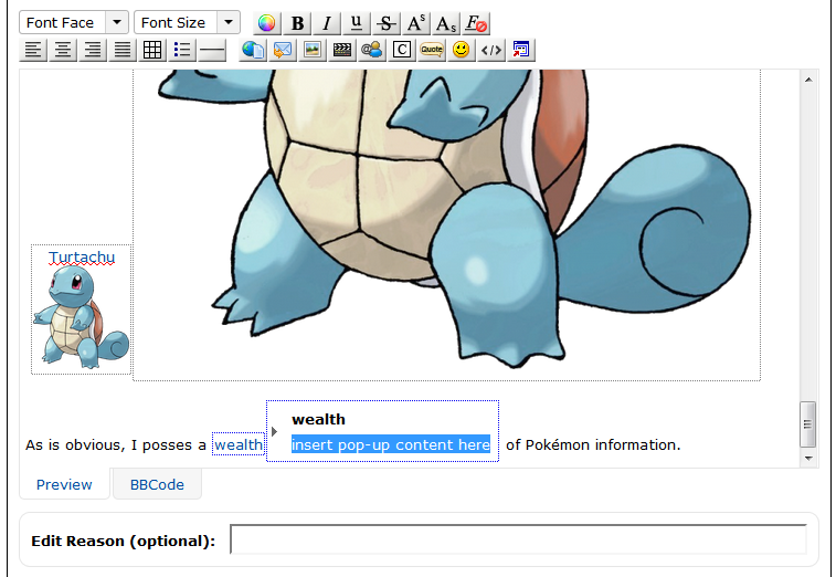 Fig. 6 Fig. 6 - A newly-inserted pop-up with a content placeholder. The content placeholder can contain any text, and can vary between special classes. It is automatically highlighted by the editor so that typing immediately after a pop-up is inserted will replace the placeholder with new text or content.
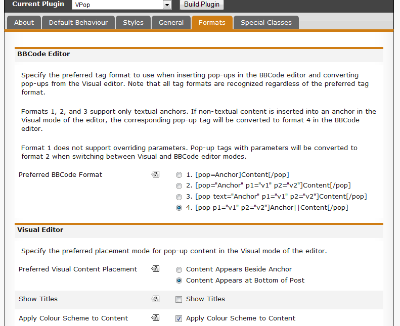 Fig. 7 Fig. 7 - The Formats tab in the VPop UI (settings). The UI is extensively documented and provides descriptive tooltips, hence the purpose and usage of most settings should be reasonably clear.
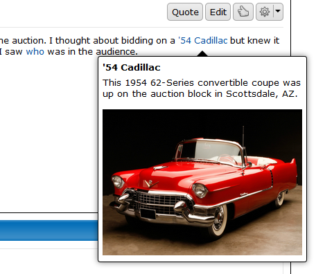 Fig. 8 Fig. 8 - Default look for live pop-ups. Pop-up content has the same background colour and text colour as the post containing the pop-up, a bold title, rounded corners, a thin black border, a shadow, and a medium stem. Pop-up anchors appear in the style of hyperlinks.
 Fig. 9 Fig. 9 - A post containing multiple pop-ups in "live mode", with a borderless, transparent image pop-up open to show a full-sized version of an avatar thumbnail. Pop-up anchors appear with formatting. Content is hidden unless a pop-up is open. Contrast with Fig. 10.
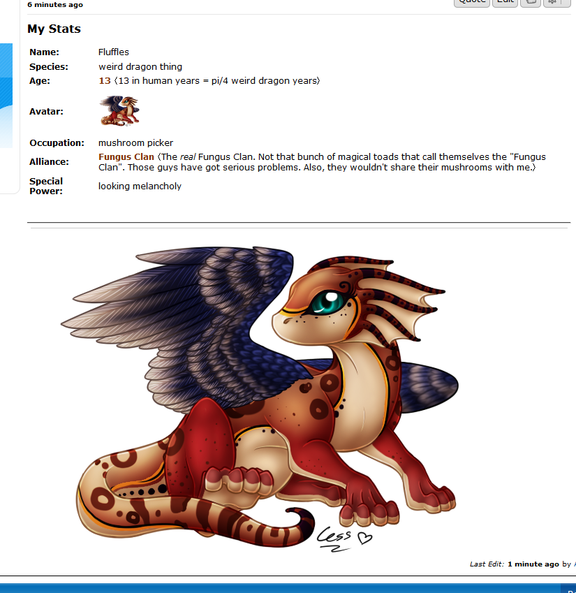 Fig. 10 Fig. 10 - A post containing multiple pop-ups in "placeholder mode". By default, anchors appear with no special formatting in this mode. Content for a text-only pop-up is expanded beside its anchor, and content for a non-textual pop-up appears at the bottom of the post. Contrast with Fig. 9. In this screenshot, anchors appear with formatting even in placeholder mode due to "Preserve Anchor Formatting" being checked in the plugin settings under Placeholders in the Format tab.
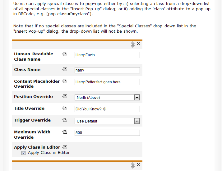 Fig. 11 Fig. 11 - A special class definition under the Special Classes tab in the VPop UI (settings). Special classes provide pop-ups with new styles and default attributes on a case-by-case basis.
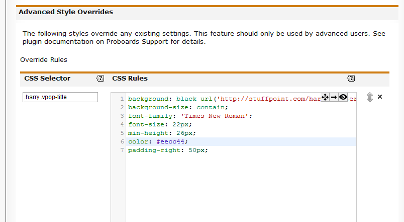 Fig. 13 Fig. 13 - An advanced style override (ASO) definition in the Advanced Style Overrides section under the Styles tab in the VPop UI (settings). ASOs facilitate creation/modification of pop-up styles in both the editor and live pop-ups. Each ASO contains a CSS selector and a set of CSS properties.
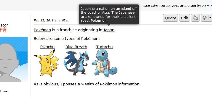 Fig. 14 Fig. 14 - A live pop-up configured to look like a Proboards tooltip using a combination of plugin settings and ASOs.
 Fig. 15 Fig. 15 - A live "Harry Potter Fact" -themed pop-up using the harry special class. The special class imputes admin-defined attributes and styles to marked pop-ups' content and anchors. Styles shown here are realized with a combination of special class settings and ASOs.
 Fig. 16 Fig. 16 - A live "Warrior Cats" -themed pop-up using the warcats special class. The class has been "decked out" with ASOs to emphasize the great extent to which pop-up styles can be customized.| | Astute readers will have noted that this plugin is marked BETA. Although I have tested it extensively on my home board, there will undoubtedly be a few problems still hiding out.
Please notify me of any problems you experience in this thread and I will do my best to resolve issues promptly.
Aside from that, happy popping!  (...not pooping. (...not pooping.  ) ) |
|
|
